MIAH ALCORN INTERVIEW
Illustrator
Saturday, June 24, 2006
BROUGHT TO YOU BY THE CHARACTER DESIGN BLOGSPOT
IF YOU WOULD LIKE TO SEE MORE CHARACTER DESIGNERS GO TO THE HOME PAGE BY CLICKING HERE
THE INTERVIEW
Tell me a little bit about yourself, about your life? Where did you go to school, and what classes did you study? What helped prepare you to become the artist that you are today?
Well I grew up in Jacksoville, Fl. Fortunately enough for me, my dad's employer was generous enough to give out hearty helpings of decent printing paper, pens, and pencils and he always made sure to bring some home for me. I always loved cartoons period, Disney classics in particular, and so naturally I tried to copy the characters that I loved to watch. I'd freeze frame vhs tapes and scribble and erase, scribble and erase..... I never did get the drawing down before the darn machine cut off.... When I was a junior in high school, my family and I moved to Brimingham, Al. and I finished high school there. I applied, and was accepted, at the University of Montevallo (a fine arts school near my parents place) and got a BFA from there with a concentration in drawing. Montevallo was a great school, only problem was it didn't offer any classes for those of us crazy enough to want careers in animation.... you know our bunch..... we always stand out in a crowd :). Anyway, my wife's friend came across an article in the paper about this community college in town that had animation classes with training from professionals at Warner Bros. and Disney. Well that was a no brainier... I applied to the school and started the program the following semester. Things were going great until my last semester there. I think it was in the last month that we found out the major studios were closing down their traditional departments! Everybody was going 3D! Well I didn't know squat about cg animation, so my friend and I decided to try our hands at illustration and neither of us have looked back since. I eventually got married to my beautiful wife Alli, had two great little boys (a third one on the way...lets hope its a girl :), and eventually moved to Chicago Il, to work with some fantastic people up there... hey guys! Well the job was great, but good things can't last forever, so now I'm working as a freelance illustrator/character designer/dad and it's great!
How do you go about designing a character, and what goes through your mind, from start to end?
Hmmm....... honestly for me the design is a result of a lot of different things. Some of them I can explain, some I can't and I think the process will vary with each project you work on. Every artist has a particular style in which they draw, something that comes naturally, you know... that just seems to flow. For me the simpler the better... regardless of how complex the final design needs to be, I'll start with simple shapes and add detail where it's appropriate. I've never really been one to do too much underdrawing, so I'll try to visualize a pose that best describes the type of character I'm going for and I'll really try and hit that pose in one drawing. Sometimes I get it in that first drawing, but most of the time it takes a page or two until I feel like I've hit on something worth developing. Once I'm happy with that rough, I'll start tying it down more and making little corrections here and there, moving arms out, checking for tangents, pushing expressions and acting, etc. And that's pretty much it... fairly simple and rudimentary, but true anyway.
Another huge part of my design process deals with the idea of simple vs. complex, or more specifically the idea of detail within a simplified form or shape. For me detail in a design can be used for a few different but extremely useful things.
The first is to help describe form or mass of an particular shape without breaking the graphic nature of the design. I find this particularity useful when describing things like the character's hair. It'd be really easy to just add some lines to indicate the idea of hair, but for me its much more than that. The lines I add are there to describe the mass of the hair and help indicate the flow of the form. Line weight here is extremely useful as well as it helps to further push this idea of indicative form and mass of the object.
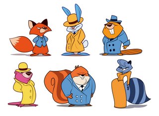
The second is detail for the sake of contrast. A character built out of simple shapes is just that.... simple. So often times I'll start adding detail within the shapes to help define what that shape is. In working through this process, some shapes naturally become more detailed than others (with me it's usually things like clothes and hair) and innately this adds contrast to the design and makes it more appealing and interesting to look at. Having variance of detail throughout a design also helps to define the most important part/attributes of a character, so I'll try and keep that in mind as well.... it's always important to know what you want the audience to focus on and I think something with a bit more detail tends to draw more attention. Of course detail within a design can also help lead the viewer's eye to a particular focal point. With most characters this would be the face (and more specifically the eyes) so keeping this in mind, maybe the lines of the hair flow down towards the face and the pattern of the shirt happens to be vertical stripes. Both of those details help to draw the viewer's attentions back to the eyes, which in this case are the main focal point. Something else I'm currently exploring is the idea of detailed shapes as framing devices within a design. Again we can go back to the idea of the head shape/ hair and body relationship. A detailed hair shape and a more complex shirt design can act as framing devices for a less detailed face and in that way help solidify again the main focal point of the design. It's something that I'm still working out, but interesting none the less.
The third idea deals with detail to add weight. I hate looking at a drawing that feels floaty. Solidity within a design can be reached in a lot of different ways, but for me its really simple. Kind of a cheat really. A while back I was working on a design and I was trying to figure out places to add contrast and I thought, maybe I'll add a seem on this pair of pants, so I did and something really neat happened. That one extra line added form to a flat object without any shading, without adding a lot of extra detail, without breaking the graphic nature of the design. And from then on I started using that idea in a lot of my designs. I like to use it on all kinds of things, but find the idea most useful when dealing with things like the bottom of pants legs, or the cuffs on a shirt, maybe the rim of a hat, and so on. Just a neat little way to add weight and form to a flat shape. Again, a bit of a cheat, but useful anyway.
One last thing about the idea of simple vs. complex. I think this idea is a lot like walking a very thin line.... to much detail and you lose the focal point of your design... the viewer doesn't know what to look at. Too little detail and you have this bland thing that isn't exciting or interesting at all to audience. As a character designer our job is to create a design that holds the viewer's attention, something/someone that they want to follow through the course of a film, or the illustrations of a book. The design should be easy on the eyes, you know something that's really visually interesting. So I think that if you can find that thin line and really stick to it, you'll end up with something that's really visually clear and appealing, you know....... something that is worth watching.
What do you think really helps you out in designing a character?
I think what helps the most is knowing the whos and whats of the character I'm designing. Say for instance I need to design an old man...... well immediately certain attributes come to mind.... the hunched back, high waistline, baggy eyes, droopy jowls, thick glasses, etc.... and that's all well and good, but what I like to know is who this old guy is? was he a family man or a swinger? was he in the war? is he a little crazy? did he have a drinking problem? how is he related to the main character? is he the main character? did he eat his prunes today? and so on. When I can answer questions like these the design practically happens on its own. In answering these I help define a personality and that helps determine posing and expressions, even attributes and features that I might not have included or even thought of adding otherwise. Often times I'll get an assignment that deals with subject matter that I'm either unfamiliar with or can't really clearly visualize, so I'll dig up reference, and learn what this particular thing is and how it really looks. I've always found it difficult to caricature something that I don't understand.... I guess it's like trying to draw an apple without understanding that it doesn't look like a pumpkin.
Something else that I find extremely helpful, is building up a library of shapes to draw upon. And this runs the entire gambit dealing with everything from head shapes and eye shapes, mouth shapes and teeth shapes, all the way down to body types, feet and hands, or paws, fins, wings, etc. depending on the character your designing. Having a developed library gives you a place to jump from and helps save time. A lot of the assignments I get have fairly tight deadlines, so any time saving is a necessity, and I find a good solid shape library is a fantastic means to that end. One important thing to mention is that, just like your local library, shape libraries can become out dated, providing you with information that either is redundant, or old and unappealing. So it's extremely important to seek sources that will help you keep the most recent info. on hand and at your fingertips.
Obviously it's important to reference what your fellow artists are doing....check out websites and TV shows..... go see some films and get the making of books. Look, analyze, and try to understand why what your looking is appealing, or why it isn't... and then take the conclusions you come to and apply them to your work. It's always tempting to take little design touches that other people use and steal them, putting them into your work and taking full credit. I am ashamed to say that I, like most other struggling designers am guilty of this, but I never learned from directly using something that I didn't understand. It's always more useful to study and understand the idea behind a design touch and then apply that principle to your own work. By doing this I've found that I arrive at solutions that I haven't come across yet, something that I can call my own, something original.
I also find it extremely useful to just people watch. As a father of two young boys, and a husband to a wonderful wife.... my leisure time is full to the brim... going here and there... taking my kids to the zoo...relaxing and watching TV with my wife. You know, the usual family stuff. But even when doing these things its good to keep an eye out and watch what other people are doing, how they're interacting with each other, how they go about doing the things they do. What makes them visually interesting? If I had to simplify this person/animal I'm looking at how would I do it? So I guess what I'm trying to say is just be aware of the things around you. Life is extremely vast and can provide more information to pull from than we can possibly absorb in one lifetime. Nature gives us great and complex shapes to work with, so draw upon those, simplify them, and add them to your library. Really keep those files up to date.
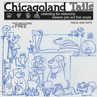
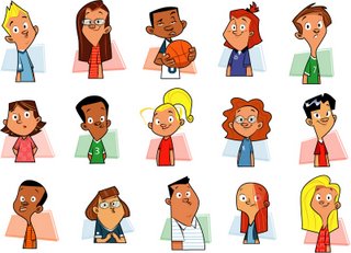
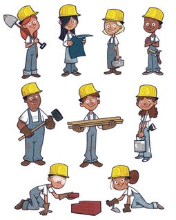
One last little tid bit of information I'd like to throw out there deals with designing multiple characters within a scene. For me, assignments like these are where I have the most fun. From a shape driven perspective this can seem really overwhelming, but I find that if I break things down and simplify them as much as possible, the piece tends to work itself out. Just like with designing one character, multiple characters have to play off each other visually, so now we apply the ideas I mentioned above about simple and complex on a larger scale, all the time maintaining the idea of creating visual interest and clarity within the design. Obviously it's important to identify what the main focus is in the scene, which character has center stage and why? Once I figure this out the rest becomes pretty easy. Having multiple characters within a scene helps also to dictate character archetypes and personalities which then help fuel my decisions to use certain shapes when describing each character respectively. But what really makes these assignments fun is getting the opportunity to create a back story within the design. I really enjoy getting to figure out who the other characters are in the piece. If it's an assignment dealing with multiple kids in a classroom setting (like most of my assignments are) I really enjoy figuring out little character quirks and adding them to my designs. Maybe there's a child answering a question that the teacher has asked, so obviously this kid would look confident. But maybe the kid next to her is tired of her answering all the questions and showing off, so maybe she's raising her hand a little higher to try and get the teachers attention. Maybe the boy next to her is shy... he knows the answer, but just doesn't want to say anything... so I'll try to figure out how he would look and what type of character he'd be. All of these ideas add to the visual interest of the piece and make it more natural, more believable. It'd be really easy to have a teacher asking a question and all the boys and girls raising their hands to answer. But where's the fun in that, what makes it interesting? All of these little ideas are things I draw from the library I talked about earlier.... actions and acting, visual reference and archetypes, you know all that jazz.
From your own experience and maybe from some people that you know, what should we put in our portfolio and what should we not?
Well I think the most important thing about putting together a portfolio is really understanding and clarifying what your applying for. Character design for TV and for Features, from what I understand, are very different . If your looking to apply for a design position in television, it's important to include a lot of different styles. This shows a prospective studio that you'll be able to jump from one show to another if need be. It's never a bad idea to include some process stuff too, you know rough drawings and multiple takes on a character to help show your thought process in getting to your final design. From what I understand features are a bit different, but I'll let someone a little more qualified elaborate on that for you guys. Of course if your applying to be an animator, the most important thing you could include is life drawings, and I mean the real deal not just figure drawings from life drawing class. Get out and draw people around you, go to the mall, sit and people watch. Scribble down some gestural stuff, try and capture the interaction of two folks talking or the energy of a guy throwing a Frisbee. And obviously a strong reel never hurts.... it's odd saying this now because, I made the mistake recently of putting some of, what I considered, my better illustration work together and submitting it for character design positions. For some odd reason I thought, "surely the people looking at my portfolio will be able to tell that I can draw pretty good based on these", but I failed to take into account all of the above. They told me they liked the work, but there was no variation there, no roughs, no thought process. And you know what, they were absolutely right.
What are some of the things that you have worked on?
Well I wish I could say I've worked in television, or on features, but unfortunately that hasn't happened yet, but maybe one day. I've done a fair amount of pitch development work for multiple clients, some for TV and some for features, and I also illustrated a children's book called
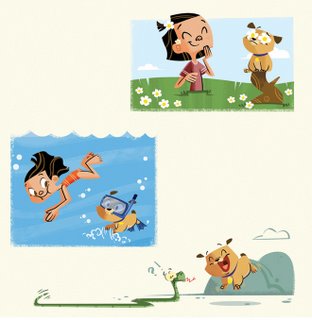
"The Year of the Dog" that released to stores this past January. I've been fortunate enough to do a bit of freelance commercial animation and some cover art for different publications as well. A lot of the freelance work I currently do is with a company out of Nashville that produces artwork for Sunday school classes for multiple church related organizations.
Is there a character design you have done that you are most proud of?
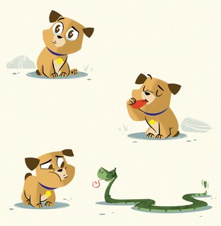
Well, I don't know about the rest of the designers out there, but after a while all I can see are the flaws in a design, so I can't say that I've ever really been completely happy with most of my work. There's always little things I'll want to go back and change. But if I had to choose one, I guess I'd say Daniel, the puppy from the children's book I mentioned above. I think he turned out pretty good. And I'm fairly pleased with the final designs for the book I'm working on now, lots of farm animals and one very small pig.
What are you working on now? (If you can tell us)
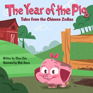
Well currently I'm working on some different illustrations for the aforementioned company out of Nashville, as well as the next book in the Tales from the Chinese Zodiac series entitled "The Year of the Pig". And there’s one or two others that I can't tell you guys about right now, but maybe sometime down the line. :)
Where is the place you would like to work if you had a choice?
I'd love to work at Cartoon Network or Nickelodeon. I know they have some extremely talented folks working on the shows they produce, so getting the opportunity to work along side them would really be something special. At this point in my career I've done a decent amount of professional work, but mostly illustration stuff, so there's still a lot of things I have to learn about the industry. From an artistic point of view, I believe the best artists are always growing, always pushing boundaries, always searching to learn something new. In order to do that in earnest, you need to be around the best, and for the kind of work I enjoy, I think both CN and Nickelodeon would be a good fit. A daunting task, but one definitely worth aiming for.
Who do you think are the top character designers out there?
Man that's a tough question. There's so many great designers out there that it's really tough to say. Quite honestly, up until the whole blog craze hit, I was hard pressed to find access to other artists work, especially other artists that did work similar to mine. I'd run across a good website from time to time, but that'd be about it. But now-a-days there's a whole slew of artists that I check out daily, who inspire me to try new things and leave me in shock and awe. So I suppose they would be a really great place to start.
If your looking for some great inspiration check these guys out. They're all fantastic (in no particular order)....... John Nevarez, Shannon Tindle, Gary Dunn, Martin Wittig, Chris Battle, Dan Thompson, Agreda, Jason Groh, Mark Ackland, Lou Romano, Steve Daye, Ridd Sorensen, Michael Smukavic, Erin Blanquet, Stef Choi, Todd Kauffman, Sean Scott, Paul Watling, Denis Goulet, Clio Chiang, Patrick Morgan, Lynn Naylor, Alex Kirwan, Gabe Swarr, Katie Rice, Jorge Gutierrez, Ovi Nelecu, Ahmed Guerrouache, Stephen Silver, Ben Balistreri, Jared Deal, Sean Galloway, Rudolphe Guenoden, Tom Bancroft, and Rob Corely.
and of course these guys, most of who's amazing talents I've been fortunate enough to experience first hand, all wonderfully talented friends and fantastic artists and designers :
Jasen Strong, Bruce Glidewell, Javier Guzman, Robin Mitchell, Bob Rissetto, Heath McPherson, Cale Atkinson, Ben Rynolds, Cedric Hohnstadt, Serapio Calm, Jeremy Spears,.... and of course.... my very good friend and personal favorite Steve Lambe.
Thanks so much guys for putting your work out there and letting guys like me have a look-see. You've all been a huge influence on my work and for that I'm truly grateful.
How do you go about coloring the character, what type of tools or media do you use?
Well once I've worked out my sketch, and I'm satisfied with it, I'll scan it into Photoshop and, depending on the style that I'm going for, I'll push on from there. If I'm going for something a little less refined, I'll typically work in Photoshop, something fairly new to me, but a useful tool none the less. I find it allows me to keep a more hand drawn feel to my work, and that's something that I really want to start focusing on more. But most of the time I take the jpg that I saved in Photoshop, and bring that sketch directly into Illustrator. From there I have a few different processes that I like to use depending on the style I'm looking to achieve.
If I'm going for a final piece that has traditional holding lines, I'll put the sketch on one layer, set it's opacity to about 40%, and begin cleaning up my drawing using the pen tool. I know...... it's a very mechanical way of working, but it's fast and effective, especially for someone like me that takes 4 or 5 five attempts to put down a nice line with a Wacom pen. So once I have all my final line work done... I lock that layer and work on a layer directly beneath it creating fill objects to add colors or tones to the piece, and continue on this way until the design is finished.
If I'm shooting for a final look that has no holding lines, I'll take my sketch set it's opacity to 40% and set it's transparency to multiply instead of normal. At this point I'll lock the layer and work directly below it adding colors and building shapes that lend themselves to the sketch. By doing this, I'm eliminating a lot of the rework that happens when you build shapes on top of your sketch with the line set to a certain width instead of none. Because of the nature of illustrator, the line width and fill that is assigned to it's respective shape tend to vary in thickness. As a result, if you clean up your drawing while leaving the line weight on (no matter what it's weight) there will inevitably be some spaces in the final color that are left behind once the lines have been eliminated. Then I have to go back and rework the shapes and tweak things here and there, and retouch this and retouch that. But if I use the process I described above, it eliminates(for me) a lot of these issues and gives me a really good idea of what I can expect to see with my final design negating a lot of the little surprises that happen working in other ways.
So once I've finished my final colors, I'll export the file from Illustrator, saving all the layer edit ability, and bring that image into Photoshop, adding any little design touches, textures, or filters that help me to further define the look I'm going for.... and that’s about it.
What part of designing a character is most fun and easy, and what is most hard?
Hmmmm..... good question. Personally I really like getting in to the characters that I create. A really good friend of mine made an interesting observation one day. We were walking back from a meeting and he said to me... "it was funny man, the whole time you were drawing, you were smiling, did you know you did that?" and I said "no I never really pay much attention." and it was true. But ever since then I pay a bit more attention to what I do when I draw and come to find out I don't only smile, I frown, and think, and look dumfounded and stupefied, all the while trying to capture a particular emotion or type of character that I'm working on. And that's what’s' most fun about it for me, becoming the things that I'm drawing...understanding why a dog is proud, or sad, or happy, or smitten, or whatever... simplifying that down to it's essence, and doing my darndest to get that down on paper.
Like everybody else (except the elite few naturals out there.... darn you guys), there are plenty of times that I struggle trying to wrap my head around what I'm working on..... the problem is that my head is pretty darn hard and won't quite stretch around the assignment in question. At this point the fun kind of goes away and the challenge of creating something that I'd rather just get up and walk away from is what spurs me on. And you know what, I think it's assignments like these that allow us to grow as artists, to push past our limitations and try something new. Personally I need these to grow...... often times a painful process, but one that I've managed to do numerous times without losing to many appendages.
What are some of your favorite character designs and least favorite, which you have seen?
I'm a huge fan of Foster's Home for Imaginary Friends, Powepuff Girls, Dexter's Laboratory, Samurai Jack, Greusomstein's Monsters, My Life as A Teenage Robot, My Gym Teacher's a Monkey, pretty much all the Pixar stuff, and The Iron Giant .. to name a few, but Foster's would have to be tops on my list. It really seems like that show helped push past a lot of boundaries, allowing the designer's to think outside the box and do things none of us have ever seen before. As an artist I think that's the kind of environment that I'd want to be a part of the most... seems like they really have something special going on there. Of course there's a couple of projects in the works that I'm particularly fond of, but not a liberty to mention.... sorry guys.
As for designs that I'm not crazy about.... well there are all kinds of projects out there that don't appeal to me, but I'm not sure that I'm the best person to make a judgment call on that one. If I had to pick a few I'd probably say Rugrats, and the new Loony Tunes cartoon on the WB. No offense, just a personal preference.
What is your most favorite subject to draw? And why?
Hooray! an easy question.... kids, because I never did grow up. :) Outside of that I really enjoy drawing all different kinds of animals, people, space ships, toga parties, sea monkeys, .... you name it. I really just love to draw I guess.
What inspired you to become an Artist?
Well tones of different things. I spent a good deal of time drawing when I was younger, so there were obvious influences there from the get go. I was always a huge fan of all the Disney features, but the two that really sealed the deal for me, were Aladdin, and Hercules. I remember seeing Aladdin for the first time with my friends and thinking...."man I've go to give that a shot." The drawings were so appealing and I was mesmerized by the idea of drawings moving and acting and feeling. My buddy and I spent many an afternoon freeze framing the vhs and trying to draw our favorite characters.... Jafar was the one I was going for.... I can't really remember the one he was after. So anyway, a few years later I saw Hercules and thought man what fantastic style... it was kind of my first little taste of stylized characters and I was hooked. I don't think my work ever did, or ever will achieve that level of artistic greatness, but those films really gave/give me something worth shooting for. It wasn't until I was in animation school that I started learning more about the bits and pieces that make up stylized drawing. It didn't take long for me to realize that animation was a bit of a struggle for me, and one day it finally clicked.... drawing characters was what I really enjoyed and what came easiest to me. So from then on that's been my focus.... Outside of the artistic realm, I think my Dad always had a bigger influence on me than he knew. He wasn't an animator or anything, but he'd always do these great drawings for my birthday of whatever character, or series I was into at the time. One year it was transformers, the next it was ninja turtles,.... you name it and he'd give it a whirl, and they always looked spot on to me! I really think he was a bigger influence on me artistically than even I realized.
What are some of the neat things you have learned from other artists that you have worked with or seen?
Hmmm... honestly I think I'm always learning more from the rest of the artistic community. I really think I need to step it up in return b/c I'm not sure the trade's so even at this point. From a design standpoint though, I guess the biggest thing I've learned is that every artist has a process, each a little different, a little quirkier that the last... and that's all right. I think we're all wired a little differently and that's what keeps the great and inventive work flowing. For the longest time I wanted to be able to draw like a certain artist, but I was shooting myself in the foot and never really getting anywhere. But once I realized that I needed to just draw/design the way I would do it, work started becoming fun again, new ideas started forming, libraries were erected, file cabinets started filling up, and I was off and running.
Having said that, I think it's extremely important for me to also say that I believe I've grown a bunch in the past year or so, and that wouldn't have been possible without the influences of the artists around me, so a big thanks to you guys... you know who you are.... With their help, I started thinking outside the box, trying new things, and really having fun again. Hooray for fun!
What wisdom could you give us, about being an Artist? Do you have any tips you could give?
I think the little bit of wisdom I'd share would be something like this..... be observant, stick to your guns, and create work that makes you happy.... work that you enjoy. Typically enthusiasm that you have, will show through in all the elements and aspects of your work and your process. After all...... design should be fun and something your pumped up about, and looking forward to. You should want to do it on your free time, so draw, draw, draw! If I wasn't doing this for a living, I'd still spend time drawing just for me, and I'm sure most character designers would tell you the same. If you have some time, get out and do some life drawing. Take an afternoon and go to the Zoo and sketch away. Try to capture some of the things we talked about earlier and just have a good time.
I'd also suggest getting familiar with the artists around you, learn as much as you can about their work and their process, discuss things like design theory or other artists you enjoy and why. With tons of great blogs like this one, check out some of the links on your favorites artists' blogs and search through those. Study the aspects of other professionals work, and apply the best principles to yours, not copying their work mind, but learning the whys and hows behind their decisions and adapting the answers to your ideas.
Email some folks and ask them questions about they're work. Speaking from personal experience, you'll be surprised how much alike your are and how forthcoming most artists are with information, no matter how close they are to the pinnacle of design expertise.
And lastly be open to criticism and willing to grow. Know and understand that there's always a bigger fish in the pond and that, in order to one day be that fish, you need to gain the bumps and bruises that help you steer clear of the fishing lines. Criticism is never a bad thing as long as it's constructive, so be willing to listen to what others have to say about your work, no matter how painful, because often times they see things that you can't. This is something that I'm still working on, but I have to say that it's been extremely beneficial, so we can struggle on together... sound good?
If people would like to contact you, how would you like to be contacted?
Well I'm always open to emails, so If anyone has any questions or just wants to say hey shoot me an email. I love to hear from ya. :)
http://alcornstudios.blogspot.com/
miah@alcornstudios.com
Finally, do you have any of your art work for sale (sketchbook, prints, or anything) for people that like your work can know where and when to buy it?
Right now, all I have to offer is the childrens book that came out in January called "The Year of the Dog". You should be able to go to any Barnes and Noble or Books a Million and pick up a copy. I believe Amazon.com carries it as well. Other than that, my buddy Steve Lambe and I are planning on putting together a sketch book for this years Comic Con. in San Diego. So if that materializes, you can grab a copy there, or thru one of our websites. And I guess that's about it.
I'd also like to say a quick thank you to Randall for putting together this great blog. It's one that I frequent often and have learned a lot from, so thanks so much for giving me the opportunity to share the little bit of knowledge I have with all of you guys. For everyone that stuck with me through all the questions and my incessant babbling, thanks for taking the time to read this stuff and for checking out my work. Long live the Character Design Blog!
Thank you for the great interview Miah.
Subscribe to:
Posts (Atom)


